
Corbel
Improving the reading experience on-screen through advancements in technology.
The type image seen on-screen is limited by the resolution of the display used. Making more pixels available to render the type at a small size requires a physical change in the pixel count of the actual screen. Microsoft’s Advanced Reading Technologies Group were keen to find a way to increase resolution through the use of software alone. As a result of their research and development they created ClearType.
Pixels on an LCD screen are divided into three vertical stripes, or subpixels; one each for the red, green and blue channels of RGB colour technology. ClearType addresses each of these colour subpixels individually, essentially tripling the perceived resolution of type on-screen.
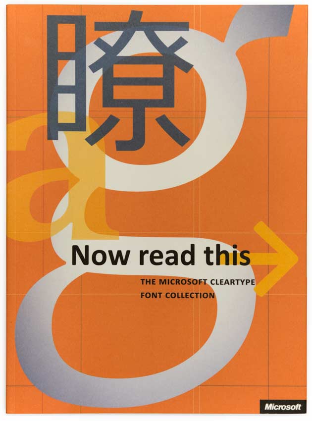
1. Now read this, published by Microsoft to introduce the ClearType font collection, 2004
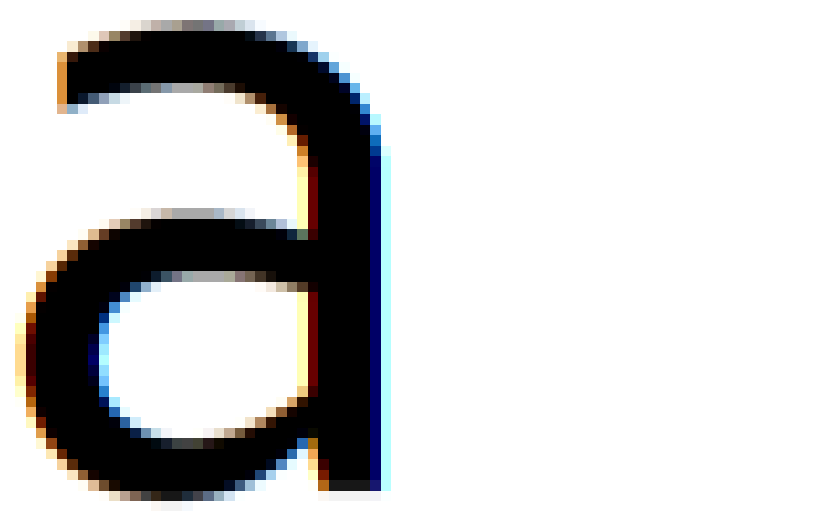
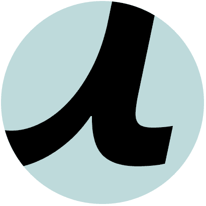
2. Corbel lowercase a showing subpixel rendering during the typeface development
Subpixel rendering improves the horizontal aspect of the type image, but not the vertical. As a result, steps in a letter’s shape become apparent as it curves round. To further enhance the rendering and resolve this, anti-aliasing is applied in the y-direction [fig 2]. The rendered quality of the final image is immediately obvious and made more stunning through the higher resolution screens that are now available.
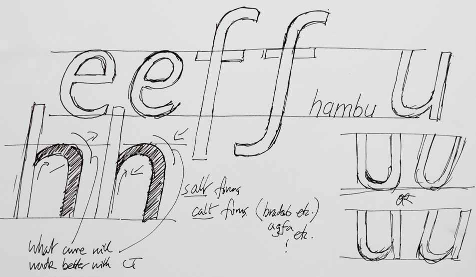
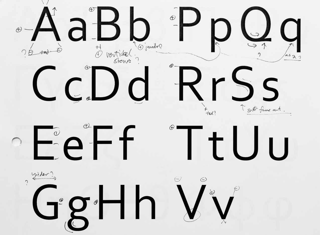
3. Early notes exploring curves and shape details
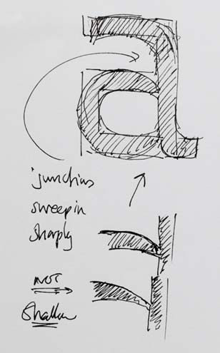
4. A note about junction detailing
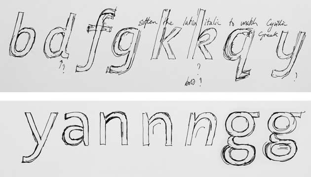
5. The top picture shows sketches for a more fluid italic, below shows a two-bowled g
To showcase the ClearType technology used on Windows, Microsoft commissioned a set of six text types [fig 1]. We were asked to submit a sans serif design for the collection.
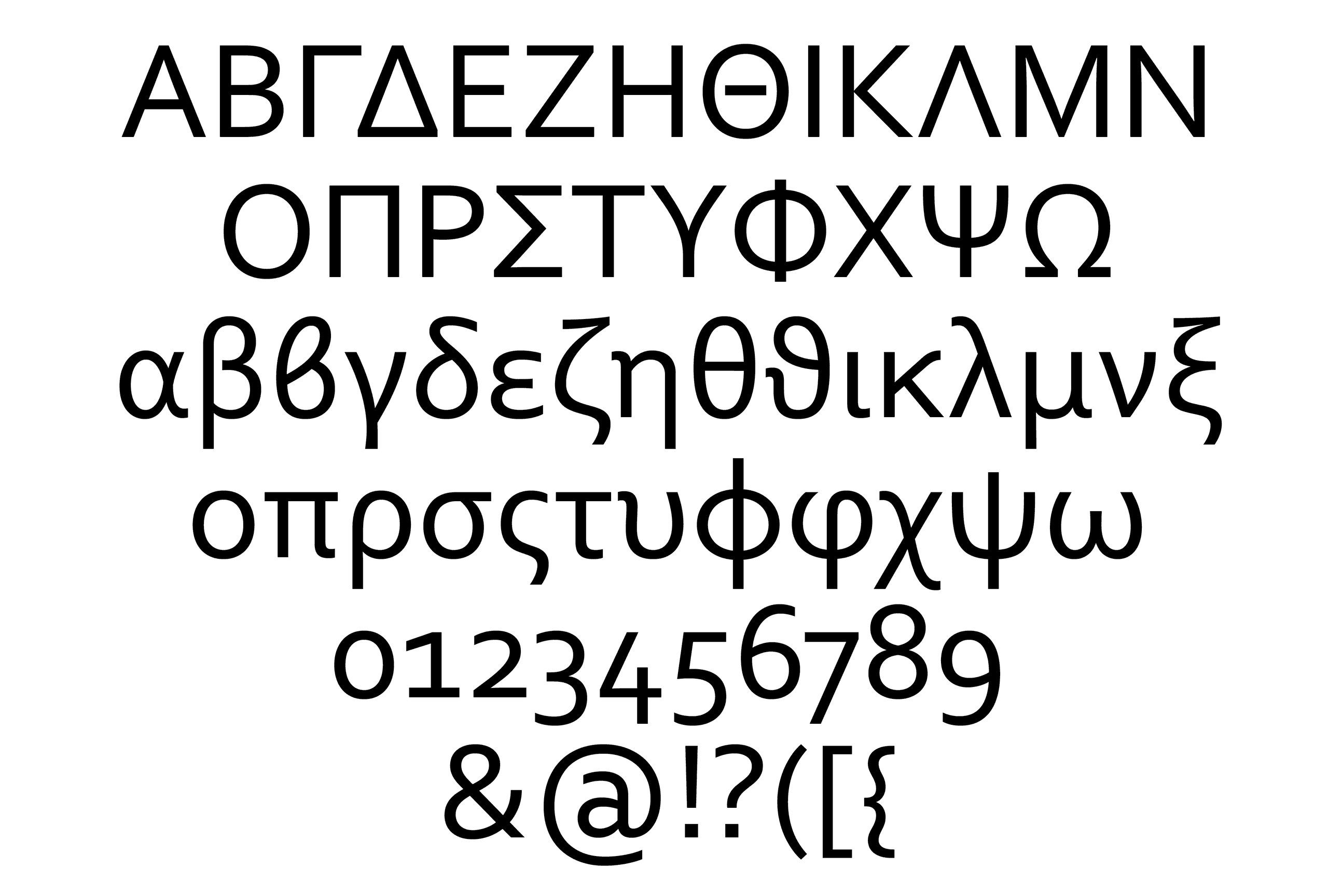
Corbel was developed simultaneously in three scripts (Latin, Cyrillic, and Greek), with regular, italic, bold, and bold italic styles [figs 6—9]. Additional glyphs were designed, including small capitals, superiors, lining and non-lining (old style) figures, to take advantage of the advanced typographic features of OpenType.
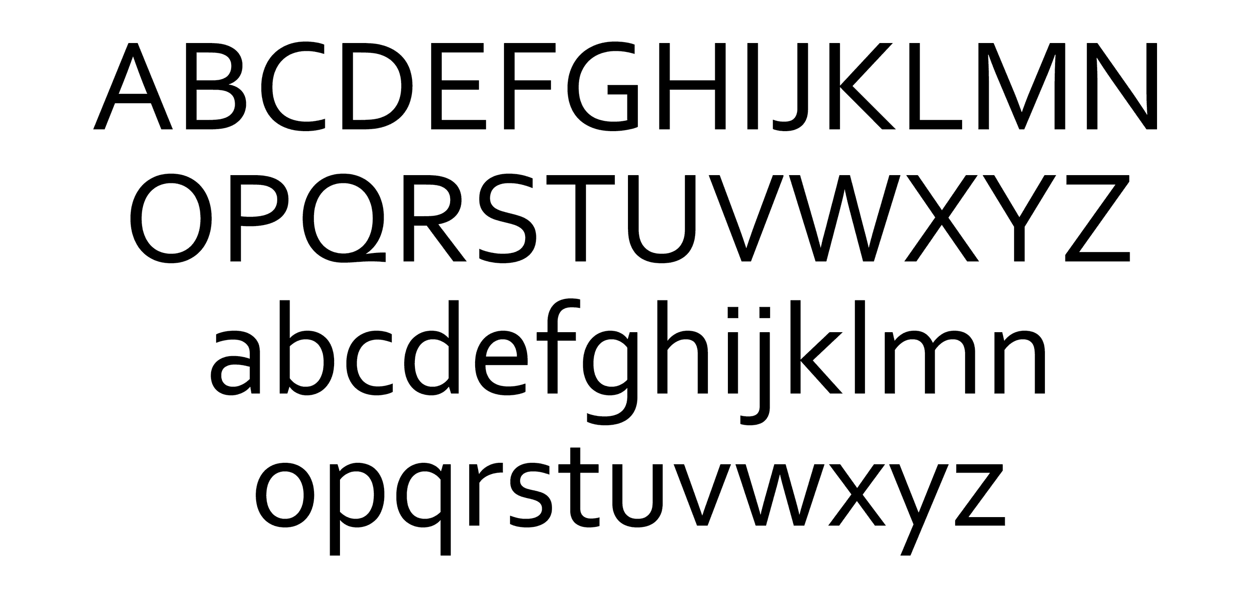
6. Stage development of Corbel Latin, the two-bowled g was replaced for a single-bowled version
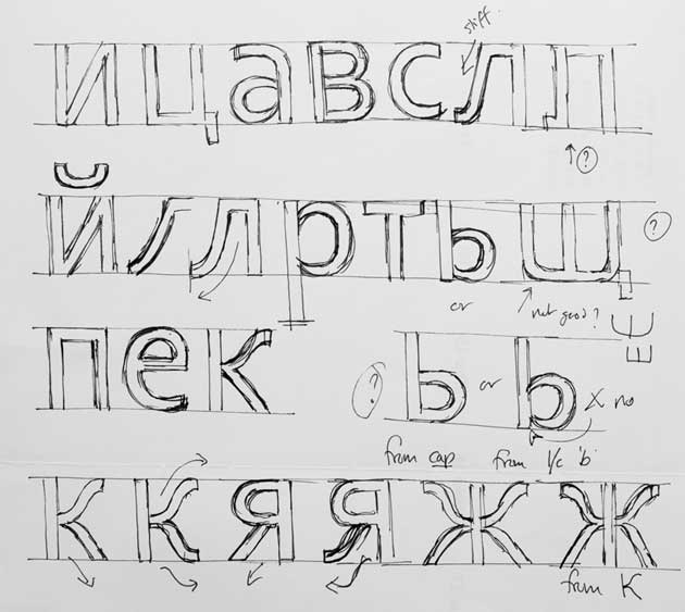
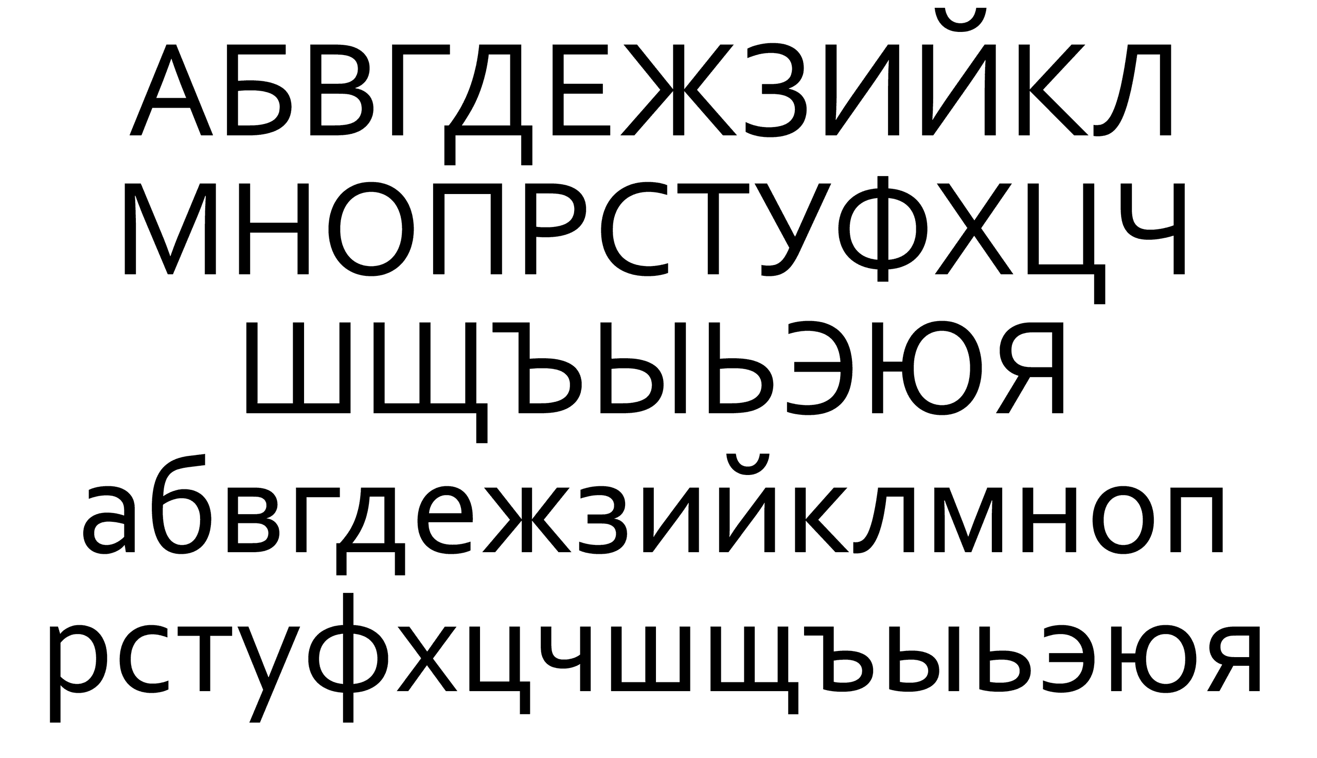
7. Sketches for Corbel Cyrillic
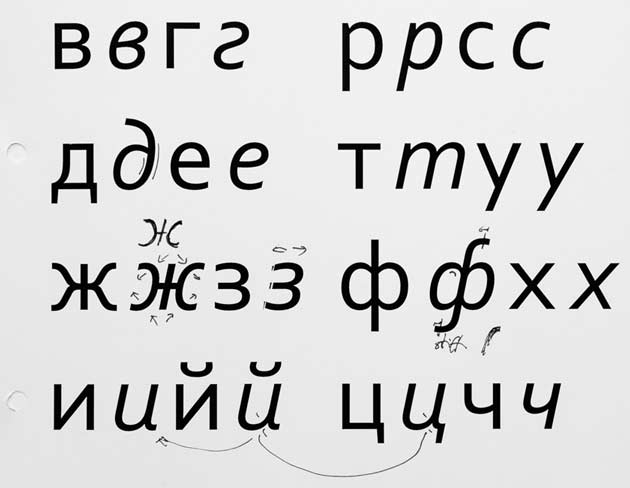
8. Stage development of Corbel Cyrillic
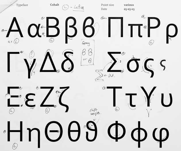
9. Stage development of Corbel Greek (the image also shows the original development name, Cobalt)

10. The definite junction seen in the roman fonts

11. In the italic, the arches branch smoothly from the stem

12. The roman fonts have a more rigid, static structure
13. The italic fonts incorporate a more fluid structure where possible

14. The static leg of the Greek lowercase lambda

15. In the italic, the lowercase lambda is allowed to flow more
The design of each script influenced each other, especially with the italics. In order to maintain a consistent feel across the family all the italics gained a more cursive structure where possible. Strokes branch smoothly from a stem, there are additional curved features to the d, k, l, y in Latin which also find placings in the Cyrillic and Greek [figs 10—15].
Further reading
Berry, John D. Now read this: the Microsoft ClearType font collection, Microsoft Corporation, 2004
Leonidas, Gerry. ‘A primer in Greek type design’, Language Culture Type, ATypI, 2002
Yefimov, Vladimir. ‘Civil type and Kis Cyrillic’, Language Culture Type, ATypI, 2002
Zhukov, Maxim. ‘ITC Cyrillics, 1992–’, Language Culture Type, ATypI, 2002
—. ‘The peculiarities of Cyrillic letterforms: design variation and correlation in Russian typefaces’, Typography papers, number 1, 1996
Typeface details
There are 4 fonts in total
Regular, Italic, Bold, Bold Italic
Latin, Cyrillic and Greek
Each font has 987 glyphs
Included with Microsoft Windows OS and MS Office apps
Read more in Footnote 07
Completed 2004