
Trilogy Sans
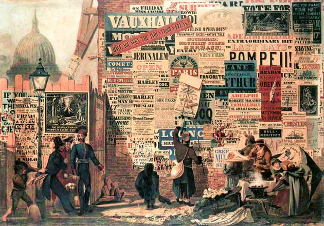
1. John Parry’s watercolour, A London Street Scene, 1835, shows the typographic landscape, Alfred Dunhill Collection
Trilogy is a big typeface. An integrated type system with 103 fonts of Sans, Egyptian and Fatface.
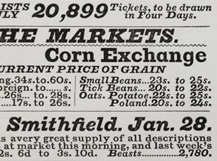
Inspired by the printed ephemera of the early to mid-19th century which is visually rich and freely mixes together a range of diverse styles. This mixing of type styles, increasingly embellished with ornament, reached a chaotic peak by the end Victoria’s reign. It became seen as bad taste, and slowly a cleaner style started to emerge, bolstered by the murmurings of modernism which were beginning to take hold. But the loud, brash and visually exciting poster types were here to stay.
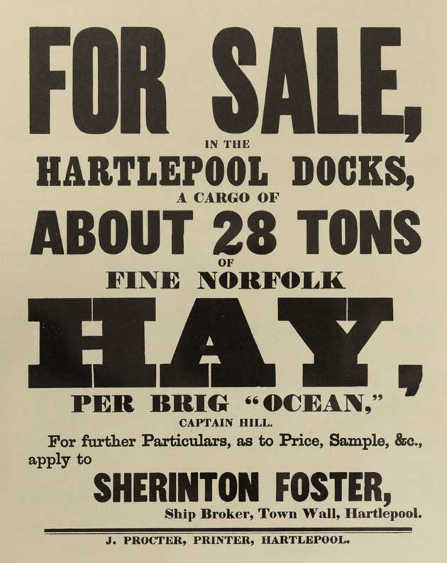
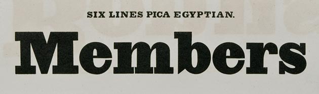
2. Auction notice, c.1859
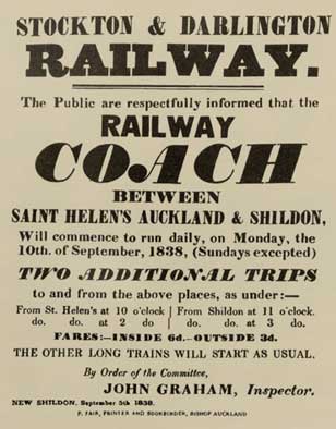
3. Railway notice, 1838
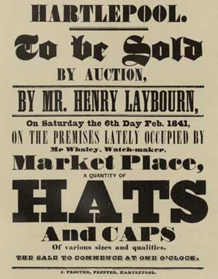
4. Auction notice, 1841
Examples of printed ephemera from the period demonstrate a playful level of visual excitement [figs 2, 3, 4]. It was interesting to read an article printed in Typography, no.3, 1937, titled ‘Type mixtures’. Where, the primary instigator of ‘the new typography’, Jan Tschichold, modifies his dogma to allow the mixing of type styles as a means of enhancing typographic layout. One can begin to see parallels with the printed ephemera of 100 years earlier, but now controlled through the judgmental eyes and skill of Tschichold as a modernist [fig 5].
5. Experimental layout with mixed type styles, Jan Tschichold, 1931
6. The design grid for the Rotis type family shows the tight relationship of Sans, Semi Sans, Semi Serif and Serif, 1988
Increasingly there are many typeface superfamilies which offer the typographic designer a huge choice of variants such as sans, serif, semi-blends, informal, and so on. The benefit to the designer is that each variant is related, with all constituent members designed around the same skeletal structure [fig 6].
The intention is that the different styles within the one typeface all easily blend together. Harmony is created through constants, a visual sameness. Yes this works, but one could equally argue that this approach removes (or reduces) the benefits more positively contrasting type styles can bring to a typographic design. This flexibility has been overshadowed by the type superfamily, and it was just this idea of pursuing harmony through contrasts that the design of Trilogy aims to explore. The early 19th century saw the emergence of the fat face, Egyptian and sans serif as defined styles of type. It’s these three primary styles that form the base of Trilogy.

7. Two-line English Egyptian, William Caslon IV, 1816
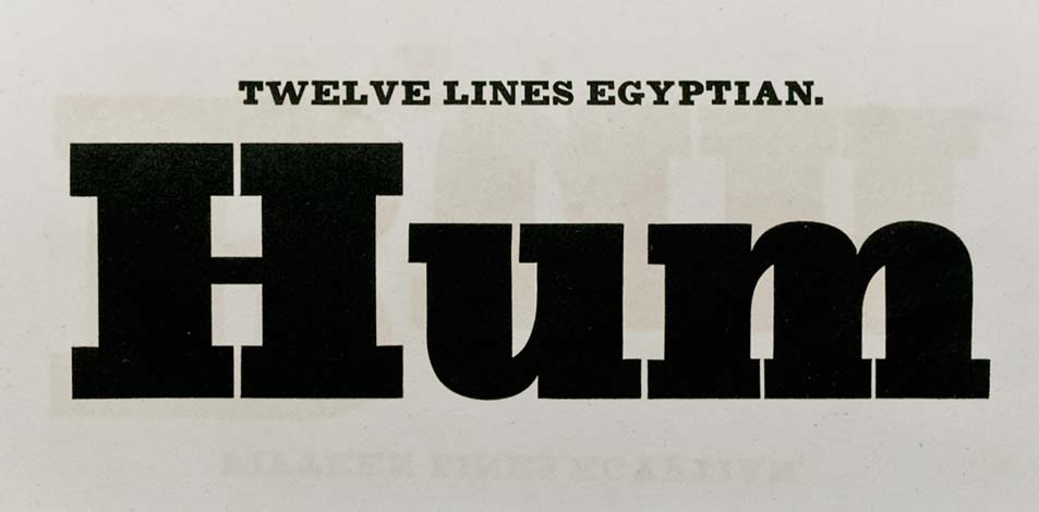
8. Two-line great primer Sans serif, Figgins, 1832
Trilogy Sans
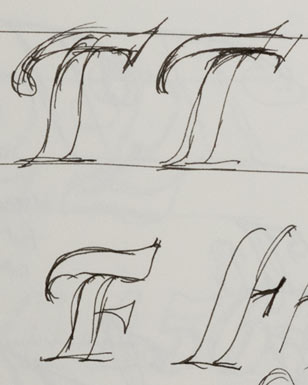
In 1816 William Caslon IV was the first to show a sans serif typeface [fig 7]. However, this type never took off and the style was abandoned until 1832 when Figgins introduced the Two-line great primer [fig 8]. His was darker, cruder but ultimately, and importantly, successful. Today the sans serif is omnipresent. In its simplicity it manages to be highly individual and versatile. It can be invisible, stylish or loud. It informs us at small sizes in tables or directs us on large signs, and it’s because of this flexibility that the sans serif is at the core of Trilogy.
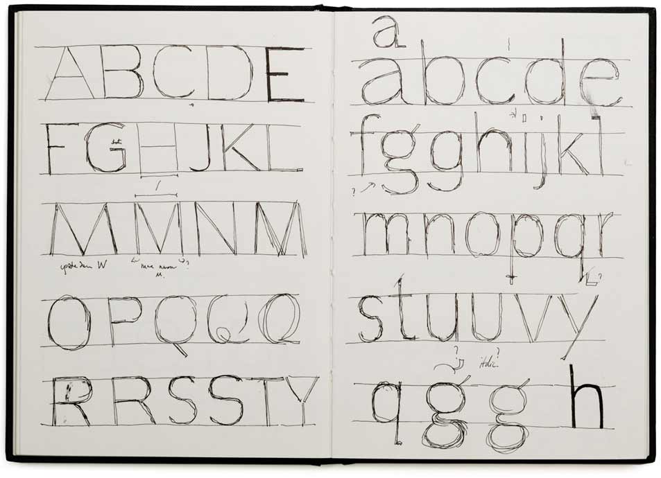
9. Early skeletal sketch for Trilogy Sans
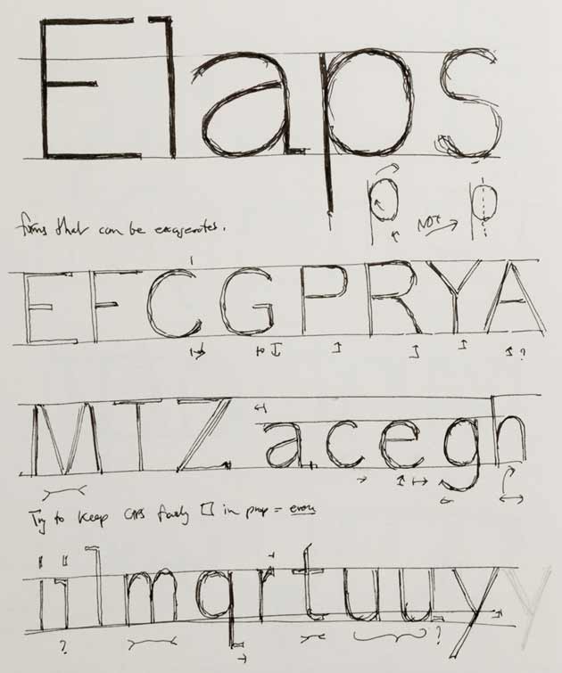
10. Sketch showing the short crossbar of the capital E
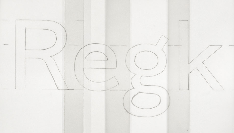
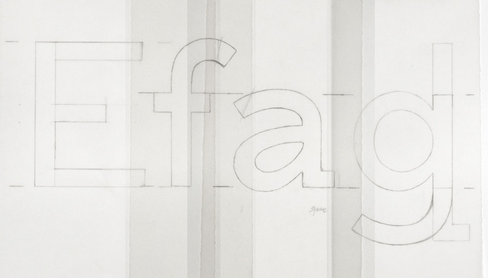
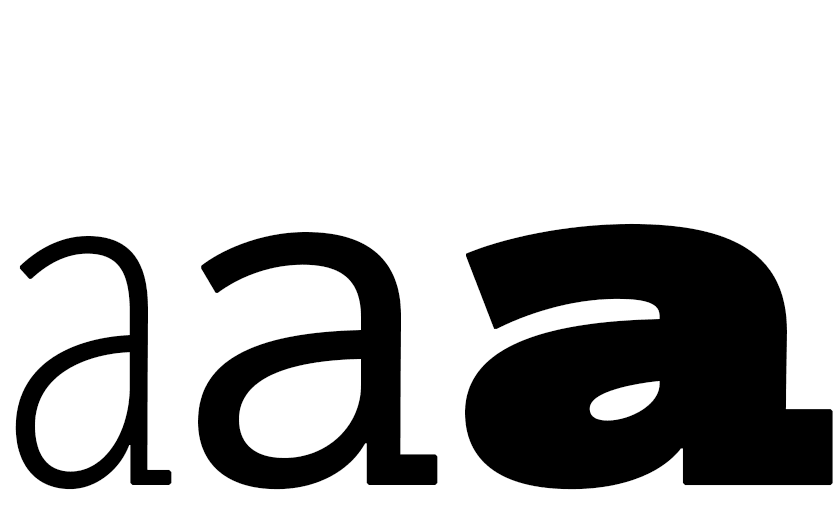
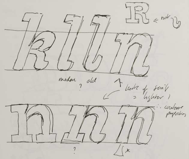
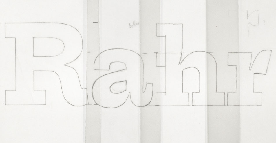
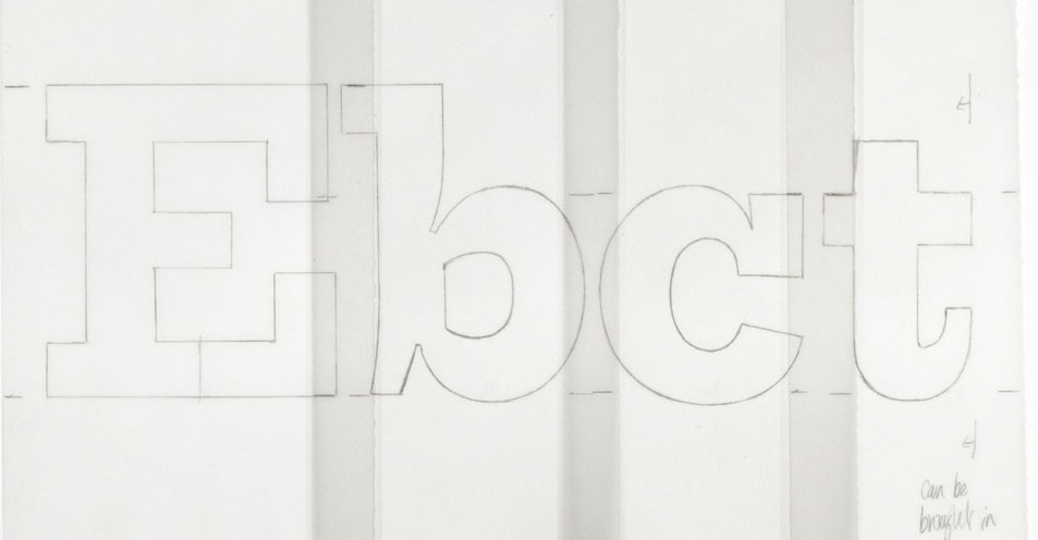
The initial sketches include alternate shapes for g and u as well as highlighting small details, such as the use of a slab at the foot of the lowercase a [figs 9, 10, 11]. The general design aims for a proportion and shape that’s reminiscent of the early grotesques and maintains details such as a short crossbar to the capital E and F.
The outside corners of all the characters across the Trilogy fonts carry a slight chamfer [fig 12]. This small detail reduces the overly sharp impression just enough to be perceived but not seen. Together with the overall proportions this increases the smoothness of the shapes with their restrained flowing sense of rhythm and line.
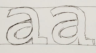
11. Lowercase a with slab foot and different treatments for the top terminal

12. The subtle chamfer incorporated through the Trilogy types
13. Early drawings showing a slightly elongated bottom curve of e
14. The short crossbar of E and shared bowl of g, d, q
15. Trilogy Sans has a wide range of weights and widths, from thin to heavy, compressed to expanded
16. Dynamic cuts seen on the inside of arches in types from Bower & Bacon, 1830
Trilogy Egyptian
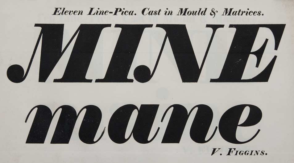
One can’t help but be amazed by the 19th century Egyptians, they’re captivating. When seen in the original foundry specimen books your senses are bombarded – you can feel the paper, smell the age, see the blackness of the ink, and generally be in awe of them [figs 16, 18]. Many of the shapes and details are incredibly modern, contemporary even. We relish their quirky details and inherent heavy awkwardness [fig 17].
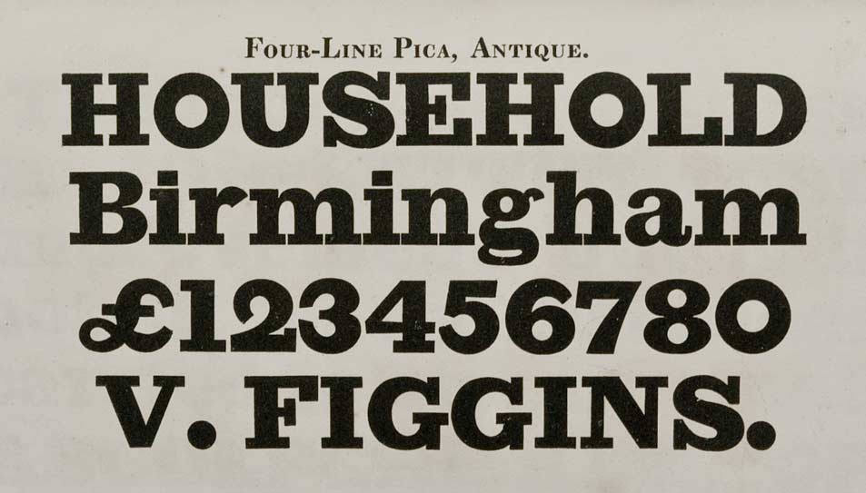
17. Antique from Vincent Figgins, 1821
18. Bower & Bacon, 1830
19. The unusual a and g as well as a more script look to the italic, Hughes, c.1822

20. Trilogy Egyptian incorporates deep cuts across its lowercase
21. These sketches show the influence of the Hughes italic
A century later, in the 1930s, there was a wave of Egyptian revivals but these were generally rigid and monotonously geometric. Trilogy Egyptian tries to capture the fullness and vitality of the original forms but also introduce a certain amount of modernity and control. Deep cuts are emphasised across the type which add another level of visual interest [fig 20]. Various parts of the italic have been influenced by the softer, more script style seen in the type shown by Hughes [figs 19, 21].
22. Development drawings on tracing paper showing he deep cut detail
23. Short crossbar of the E and the early idea to match the capital and ascender heights
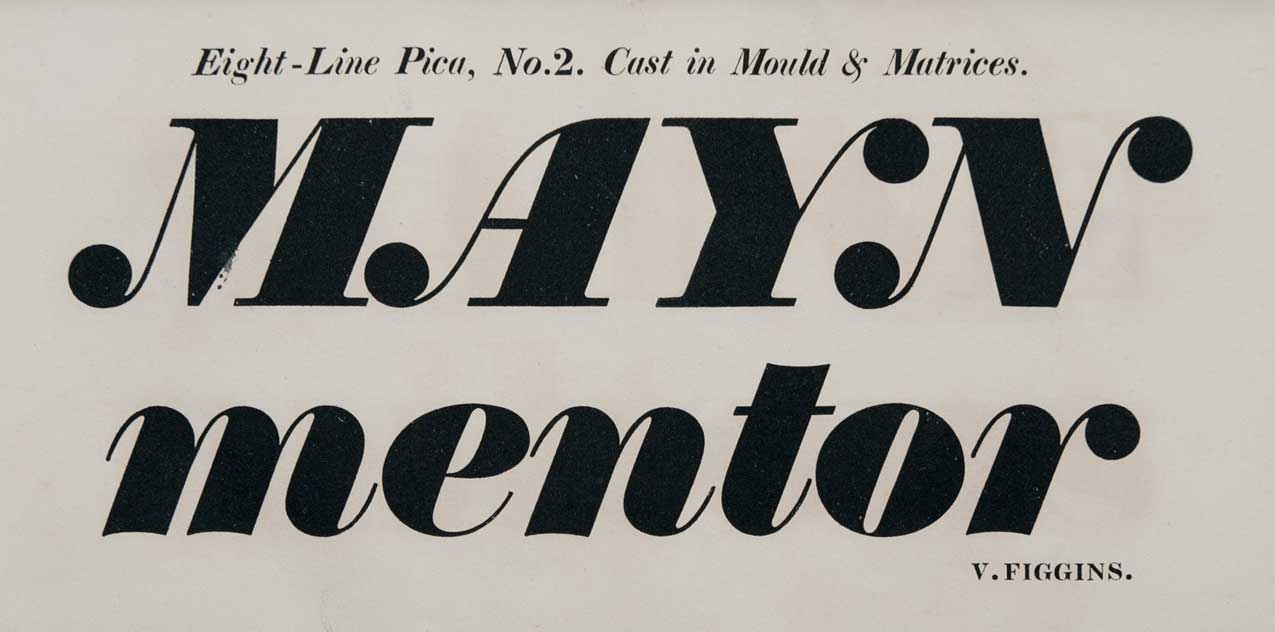
24. The Bower, Bacon & Bower sample book of 1810 shows an interesting swash g
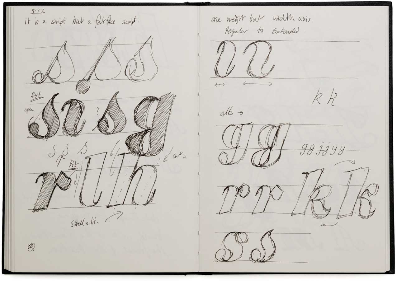
Trilogy Fatface
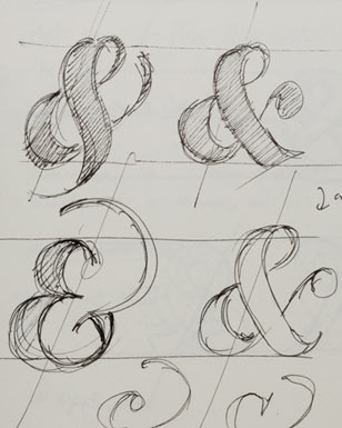
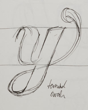
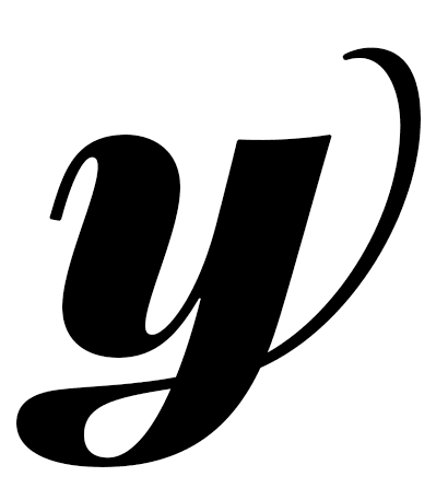
The design that became Trilogy Fatface started out as a lighter weighted script, however this didn’t gel with the Sans and Egyptian so was reworked as a heavier letter. It’s an italic only type and retains many of the lyrical details originally intended for the script. The Fatface design includes alternate letters as well as a set of swash capitals [figs 28, 31]. Interestingly, these bring a subtle hint of fraktur to the setting.
25. Fat face with cupped stems in the lowercase, Vincent Figgins, 1821
26. Fat face with flat base stems, Vincent Figgins, 1821
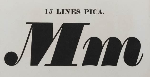
27. Bower & Bacon, 1830
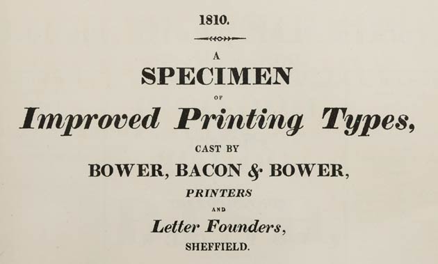
The first decade of the 19th century saw the final development of the fat face from the bold face [figs 25, 26, 27]. This heavier letter was needed for the demands of advertising, a reasonably new requirement to that of general book work. There are many exuberant shapes seen in the early specimen books which demonstrate the dazzling elegance of this style. The first showing is by Bower, Bacon & Bower in 1810 which, interestingly, includes a subtle swash detail to the tail of the lowercase g [fig 24]. This idea was developed more fully in the Trilogy Fatface [fig 33].
28. Notes for a script inspired fat face, alternate letter shapes and widths

29. Trilogy Fatface lowercase showing a cupped detail

30. Deep cuts seen in the swash capitals
31. Sketch showing the flow of swash capital stems
32. Ampersand styles
33. Swash terminal y
Further reading
Frutiger, Adrian. Type, sign, symbol, ABC Verlag, 1980
Gray, Nicolette. XIXth century ornamented types and title pages, Faber & Faber, 1951
—. ‘Slab-serif type design in England 1815–1845’, Journal of the Printing Historical Society, number 15, 1980/81
Handover, P. M. ‘Grotesque letters’, Monotype Newsletter, number 69, 1963
—. ‘Letters without serifs’ Motif, number 6, Shenval Press, 1961
—. ‘Black serif’ Motif, number 12, Shenval Press, 1964
Johnson, A. F. Type designs, their history and development, Grafton, 1959
—. ‘Fat faces: their history, forms and use’, Alphabet and Image, number 5, Shenval Press, 1947
Lewis, John. Printed ephemera, Antique Collectors’ Club, 1962
McLean, Ruari. ‘An examination of Egyptians’, Alphabet and Image, number 1, Shenval Press, 1946
Mosley, James. Ornamented types: Introduction, I. M. Imprimit and The St Bride Printing Library, 1993
—. The nymph and the grot, Friends of the St Bride Printing Library, 1999
—. ‘The type foundry of Vincent Figgins, 1792–1836’, Motif, number 1, Shenval Press, 1958
Nesbitt, Alexander. The history and technique of lettering, Dover Publications, 1957
Tschichold, Jan. ‘Type mixtures’, Typography, number 3, Shenval Press, 1937
—. Asymmetric typography, English edition, Faber & Faber, 1967
Twyman, Michael. Printing 1770–1970, Eyre & Spottiswoode, 1970
—. ‘The bold idea: the use of bold-looking types in the nineteenth century’, Journal of the Printing Historical Society, number 22, 1993