
Alchemy
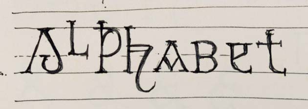
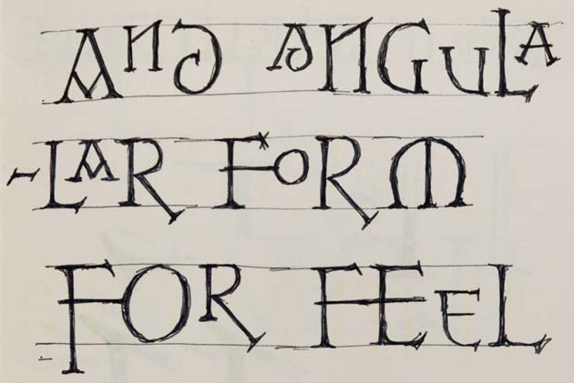
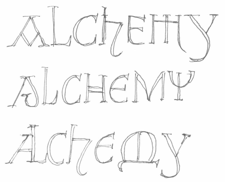
1. Sketch showing the visual texture of Alchemy
The manuscripts of the Middle Ages contain a rich diversity and ingenious use of capital lettering.
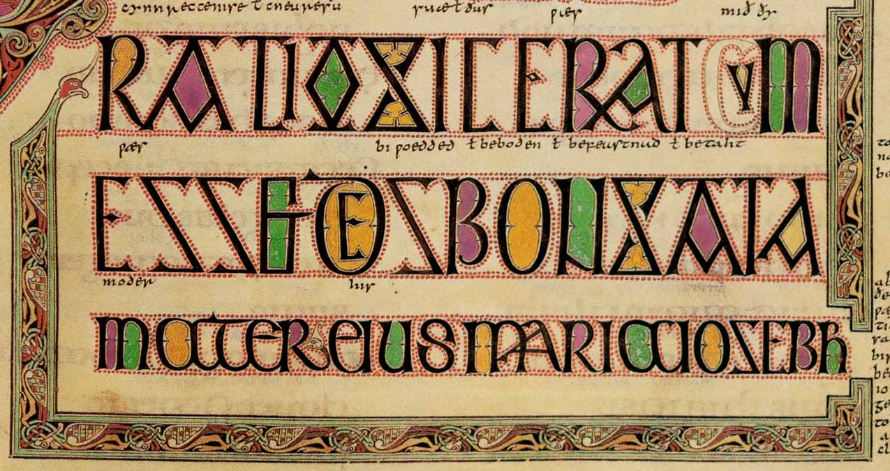
During this period the monastic scribes twisted and stretched their illuminated letters into graphic forms of almost infinite variety. The decorated pages of the celebrated Lindisfarne Gospels (c.689 AD) contain Anglo-Saxon capitals that take on many alternate forms. These are freely used together to enhance a word’s shape. The highly decorated opening page to Saint Matthew’s Gospel provided particular inspiration for several of Alchemy’s letters [fig 2].
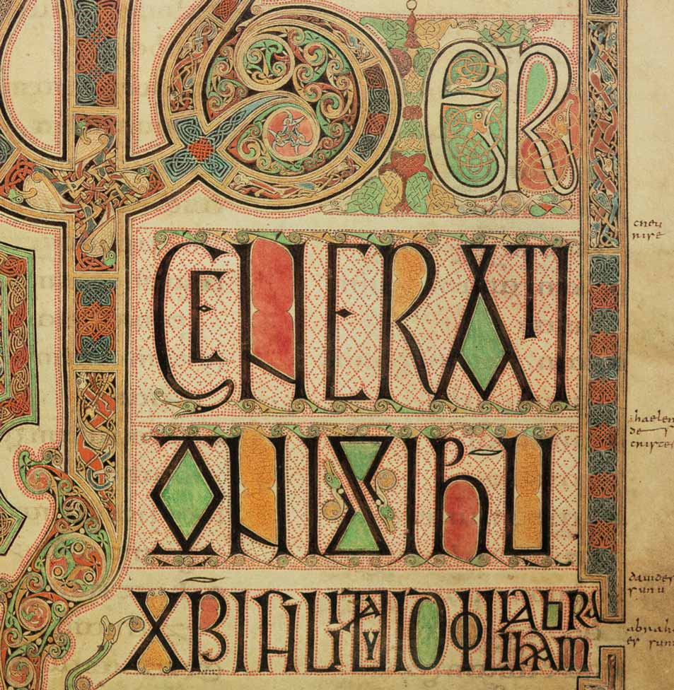
2. Detail from the first initial page of the Gospel according to Saint Matthew, The Lindisfarne Gospels, c.689 AD
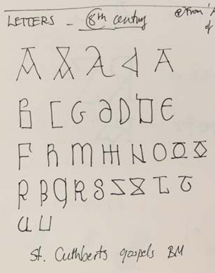
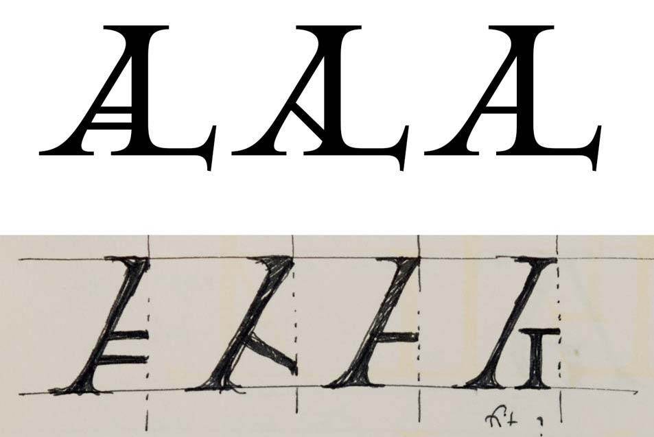
3. Letter shapes from the 8th century
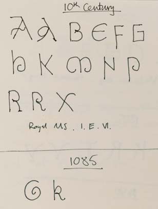
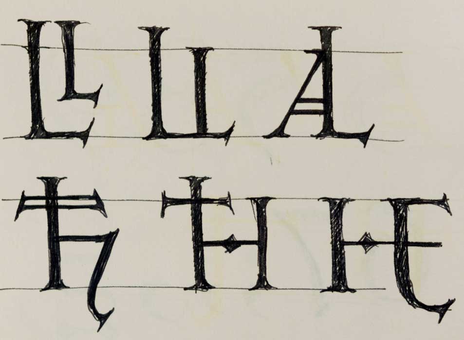
4. Letter shapes from the 10th and 11th centuries
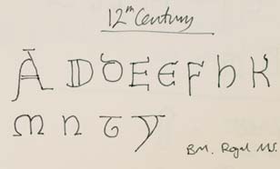
5. Letter shapes from the 12th century
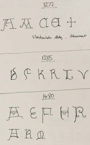
6. Letter shapes from the 13th, 14th and 15th centuries
Alchemy started life as a commission for the advertising of a whisky brand. The concept the agency developed was, ‘to transform base elements into something gold’ (think whisky), so the idea of the ancient art of alchemy fitted well. It conjures up all sorts of notions of magic and mystery. Indeed the strange shapes of several alchemical alphabets created in the middle ages all support and enhance this. However, these are coded alphabets created to obfuscate the alchemists’ intention and are not easily readable. Instead of looking directly at alchemical symbols, a quick study of letter shapes from various centuries was made [figs 3, 4, 5, 6]. The styles of letters changed over time. Those of the earlier centuries appeared more square and angular whereas in later centuries, the shapes tended to be rounder and perhaps a little more flamboyant. This showed that a rich diversity of letter shape could be included in the typeface to bring a flavour of the period and enhance the idea.
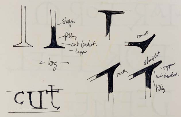
7. Serif detailing
8. Detail from the second initial page of the Gospel according to Saint Matthew, The Lindisfarne Gospels, c.689 AD
9. Variant letter designs and sizes
As can be seen in the Lindisfarne Gospels, alternate letters as well as different sizes of letters are used together with tied letters and nested letters (letters inside letters) which all help create a rich texture [figs 1, 9]. Alchemy is fundamentally a set of capitals in a single weight, so to add texture the character set was expanded to include multiple alternates, ligatures and sizes. The final range of characters available offers the user a huge range from which to craft a word or title.
10. Sketches for connecting A letters
Several ideas where discarded during the development of the design, however the idea of ligatures remained. In addition to several pre-built letter combinations, a range of connecting characters were added. A set of connecting A shapes and a connecting C can be plugged into other characters to make tied combinations. There’s also a connecting bar and a set of barbed finials which can transform a character on either side or tie several characters together.
Harmonising the characters helped to create a set of letters that could not only appear magical and mystical but also carry the authority and elegance of the more formal roman letter. Developing the serif structure was core to this process and resulted in a serif styling which is full and bracketed [fig 7]. This treatment also allowed for the diamond and barbed details to sit more comfortably [figs 13, 14].
11. Ligatures and connecting forms
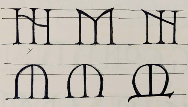
12. Alternate designs for M

13. Full bracketed serifs

14. Barbed finials
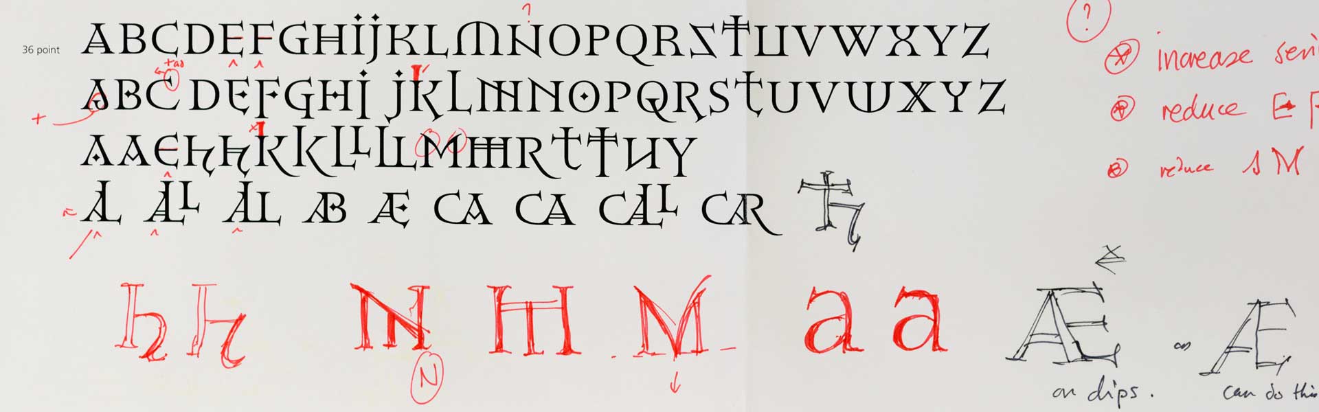
15. Correcting a design stage
Alchemy was originally published as a pack of 4 individual fonts that the user could combine to design a headline. With the arrival of the OpenType format, Alchemy was republished as a single extended font. OpenType allows easy access to the many alternate characters as well as automation of tied characters and ligatures.
Further reading
Bartram, Alan. Street name lettering in the British Isles, Lund Humphires, 1978
—. The English lettering tradition from 1700 to the present day, Lund Humphries, 1978
Drucker, Johanna. The alphabetic labyrinth, Thames & Hudson, 1995
Handover, P M. ‘Grotesque letters’ in Monotype Newsletter, number 69, 1963
Howes, Justin. Johnston’s Underground type, Capital Transport, 2000
Twyman, Michael. Printing 1770–1970, Eyre & Spottiswoode, 1970